annebarone.com
French Chic & Slim
|| 14 August 2016
Correcting Paint Color
These days, as the paint professionals know, much of the paint you buy must be corrected to achieve the exact color you chose. Today I am going to teach you the trick I used to correct slightly tan white paint that was looking orangey on my walls. What I did may surprise you.
Color and Personal Style
An important part of our personal style is our personal living space. Color — or the absence of it — says much about us. So if we set out to redecorate our living space, we want colors that express our personal style.
In my (seemingly never-ending) project of restoring this old house, in the first part I was doing very well with paint color. The paints I bought went on the walls exactly as they looked on the little paint sample cards I chose at the paint store. Bathroom, hallways, kitchen, the breakfast nook I rechristened my Bistro Barone, all just perfect. Then I came home with my paint for the dining room and living room, a Valspar paint named Riviera Dune, a slightly tan white (beige) much the same shade as Benjamin Moore’s popular Navajo White.
When I did my test patch on the wall of the dining room over the recommended two coats of primer, the color can only be described as cantaloupe. Not at all what I wanted.
My dining room is on the west side of the house. Next I painted a test patch in my office on the east side of the house. Riviera Dune dried the color on the paint sample card. What was going on? Why the cantaloupe color on the west?
Next step: Internet research on “paint color problems” and “correcting pain color.” Apparently many things can effect how a paint will look on the wall and beiges can look orangish or pinkish depending on the light in the room.
The general rule is if a beige is too orange, add a little blue.
If a beige is too pink, add a little green.
I added blue — and a little more blue. The paint was still drying on the wall as orange as before.
Having by this time absorbed at least 10 online articles on correcting paint color, I decided I needed to add both blue and green. I went to my paint supply cabinet and retrieved a partial can of aqua I had previously used on the kitchen cabinets. About a teaspoon and a half of that blue-green paint mixed into the gallon of Riviera Dune did the trick. For the dining room.
When it came time to correct the paint for the living room, I used slightly less: just about 1 teaspoon of the aqua paint to the gallon of Riviera Dune. The living room has two west windows, as does the dining room, but the living room also has two north windows. So the light in the two rooms is different.
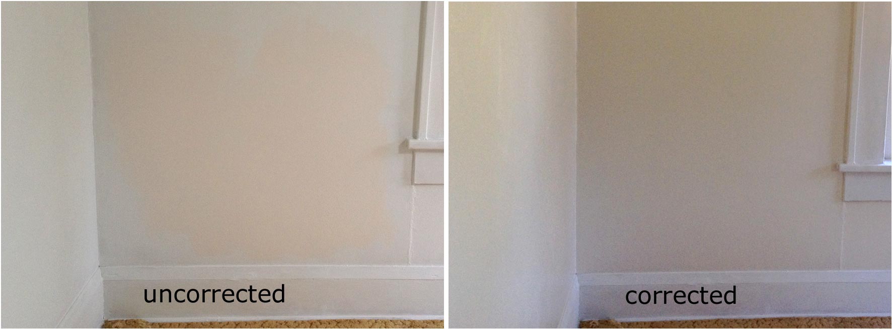
Explaining the image at the top of the page
Different screens render colors differently. But I have tried in the image at the top of the page to show you (on the left) the paint as it went on the living room wall uncorrected, a sort of pinkish orange and (on the right) the corrected paint after the addition of the aqua looking more the light beige. Different times of day with bright sunlight or overcast or with lamplight the walls take on different casts, sometimes tan, sometimes golden, sometimes a gray.
When I snapped these photos, the baseboards and windows had only been primed. Since that time I have painted them in a rich golden brown of which I had become enamored called Camel Ride. It took several tries on that color, but finally a knowledgeable young woman at the paint store solved the problem. In that case, using a different paint base to "hold" all the color. Photos of the living room with that paint soon.
I am pleased with the way the rooms are turning out and am looking forward to taking out the old carpet covering the hardwood floors and seeing how my furniture and Miss Gertie’s custom-made draperies (still usable after almost a half century) look in the room. Those burgundy red cushions on my Indian rosewood chairs with cantaloupe walls would not have been my personal style. I'm glad I got that paint corrected.
be chic, stay slim — Anne Barone
Image : Anne's living room wall with (on left) test patch too orange, (on right) corrected paint color.